Small Spaces, Significant Interactions: An Interview with Ji-Hyun Yoo
Intimate spaces offer comfort and appease our desire for privacy – attributes which Ji-Hyun Yoo, an SWA landscape architect, and associate principal with our San Francisco practice, emphasizes in her work within larger contexts. Through her work on projects ranging from corporate campuses to mixed-use developments to community open spaces, Ji-Hyun looks for the nooks that enable private conversation and personal introspection, and that serve as personal signposts in users’ discovery of landscape.
We asked SWA Associate Principal
Ji-Hyun Yoo
for the back-story:
Ji-Hyun also thinks about small spaces’ capacity to boost a site’s identity overall. We also inquired about what inspired her to carve out small spaces within SWA projects… and what draws people to them.
What interested you initially in small spaces as a concept?
While working on the Google Pacific Shores campus, I was struck by the ways in which the size of a space influences human behavior. After all, many of the most precious and memorable moments in our daily lives are associated with small spaces. For myself, I have noticed that my children are drawn to a small window nook where they can watch me depart and arrive at the beginning and end of the day. I began to think about the fact that we all emerge from the most confined and nurturing space of all – within our mothers’ bodies – and about how we might tend to seek out the same sense of envelopment and security once we are “out in the world.”
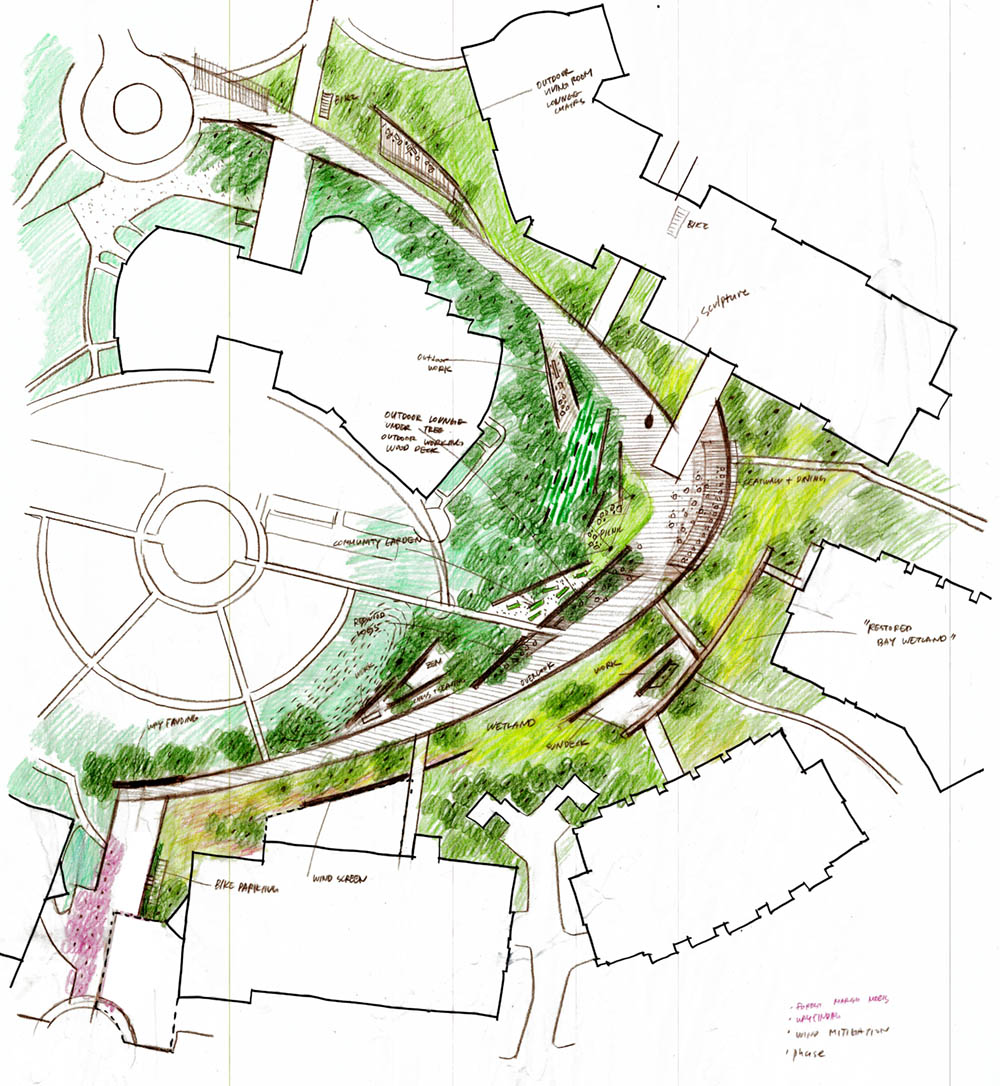
For Google, we knew that the client needed varied scales of spaces to facilitate different levels of social interaction, from large gatherings and parties to intimate conversations. To respond to that variety, we proposed three sizes of spaces. We began with a forest that separates the campus from other buildings; we wanted employees and visitors to feel that they were entering a space that was clearly defined. The scale of the forest is vast! But with the marketing center, which was intended to be a social space, I wanted to recognize and make room for people who are better at socializing in intimate settings. So, we created an even smaller space, designed with three to five people in mind.
I’m an introvert myself, so smaller-scaled spaces appeal to me personally – and I have seen the impact that they can have on important conversations and decision-making. With enclosure, there is a natural sense of safety and intimacy.
I was again reminded of the way that children interact with spaces intuitively: they find places that they can make their own. They make deep emotional connections with those particular surroundings, and develop a sense of ownership – of specialness. I think that even as adults, we have all had a favorite booth at a restaurant or a breakout workspace that is our favorite, that we subconsciously think of as “ours”– even if it is by definition a shared space! And we are a little disappointed if someone else is occupying it when we are seeking it for a private moment or special occasion. To me, this underscores the innate psychological connection between humans and small places in our surroundings.
How do you find the smaller “stories” within the larger site narrative in your work?
As landscape architects, we are often captivated by the character or physicality of a space from a somewhat “zoomed-out” perspective, and it is important to explore the site’s inherent character through our own personal lens. But there is also a certain separation between functionality and emotional expression in landscape architecture. We are looking for an overarching “story” within the site’s history and topography – the emotions it evokes – but we need to find ways to express those feelings while accommodating the necessary functions of the site. In a sense, it is a way of starting a “conversation” with future users – finding what will intrigue and resonate with them.
Another of your projects, Jianhua Center, was quite small to begin with. How did the design help to individuate it?
Jianhua Center is quite a small mixed-use site, with only 5,000 square meters of open space. From a design perspective, what was interesting was its condition; it was somewhat generic. It exuded a quality of modernity and utility, but it lacked individual character.
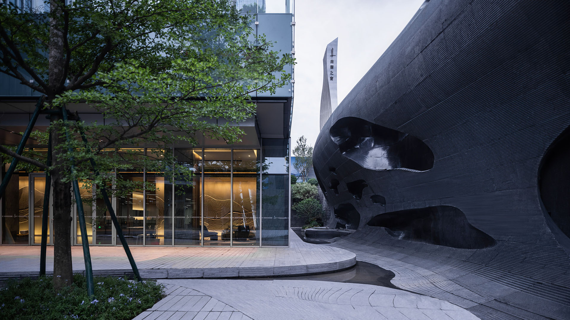
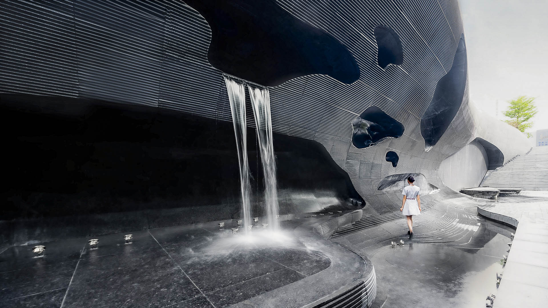
In order to overcome those aspects, the project needed a kind of whimsical experience that would make it special. We looked at the nearby canal for inspiration, and wondered: What might it look like if the canal had naturally begun to erode the adjacent main open space?
When water seeps out of rock, the landscape tends to erode and create caverns – which by definition are very private, special spaces in and of themselves. Building off of this concept, we leveraged CNC technology to create the effect of eroded bedrock. The stone joints are almost imperceptible giving the impression of a naturally curvaceous wall that emphasizes the volume and enclosing quality of the rock.
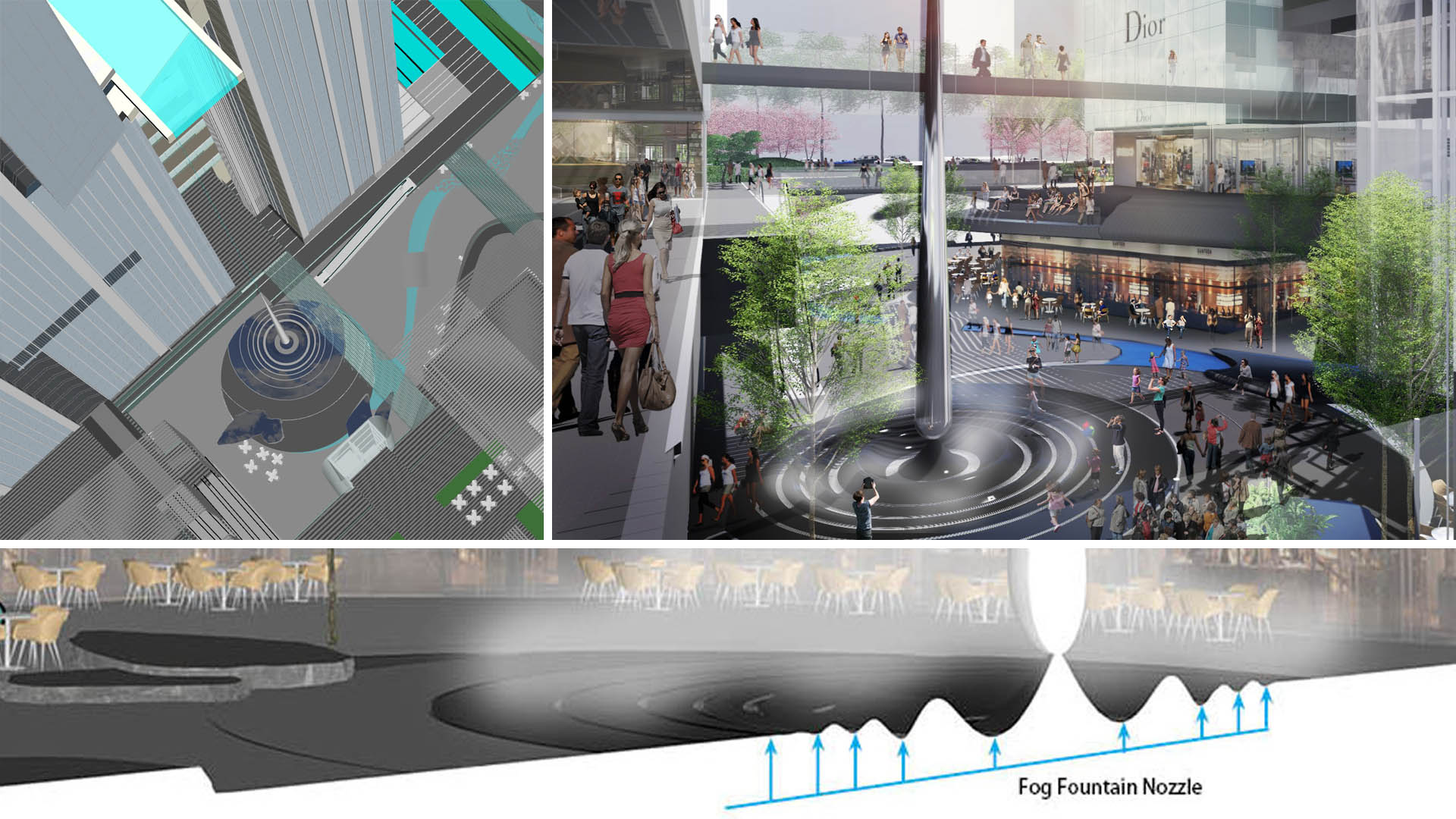
80 meters above the ground, the architect designed a striking, transparent, cantilevered pool from the “Baiyun Window” between the residential and office tower. Retail visitors would not necessarily notice this marvel from the ground, but we envisioned the water’s journey starting from a droplet coming off of this swimming pool. The droplet sculpture points at the pool above via a laser light that illuminates a series of stone rings, which mimic water ripples when it hits the ground. The “water” thus etches the ground, creating calligraphic forms that find their final form in the “eroded,” CNC-sculpted wall, which was designed to have “holes” that imply organic creation. The effect was to draw users deeper into the Center, into small, immersive spaces where people tend to gather and remain focused.
As part of the new town development plan, this project has a park frontage to the west. The grade difference between the site and the park offers a perfect opportunity to develop an F&B terrace perched over the development for relaxing and people-watching. The residential drop-off plaza below becomes an opportunity for the water story to develop into a three-dimensional, undulating plane that mimics waves diminishing into the vast hardscape of the fire-staging area.
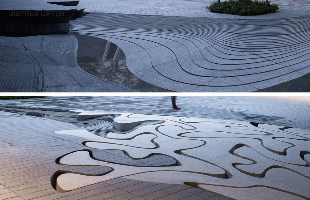
Our inspiration comes from multiple fronts: the eccentric qualities of architecture, context, and sometimes the site’s inherent issues or lack of character are all the sources of creative discoveries.
How does clients’ feedback about the anticipated uses of their projects inform whether and where to provide more intimate spaces?
Clients often have great insights about how an existing space is used as well as great aspirations for how it should be used in the future! Also, the overall framework of an open space has often already been set up by architects, including entries, courtyards, pedestrian promenades at the park interface, and drop-off zones. What we brought to the process is the narrative that people fall in love with, the knowledge of how people experience spaces sequentially, on the ground, and how that contributes to the overall dynamic of the space. It is really an interactive and collaborative process.
Light, color, and texture often contribute to the places-within-places where we experience a “found” moment within a real or imagined sense of being “lost.” Clients are most helpful when they partner with us in locating and allowing for design and intention behind those spaces, and helping us to delineate them in ways that lead to discovery.
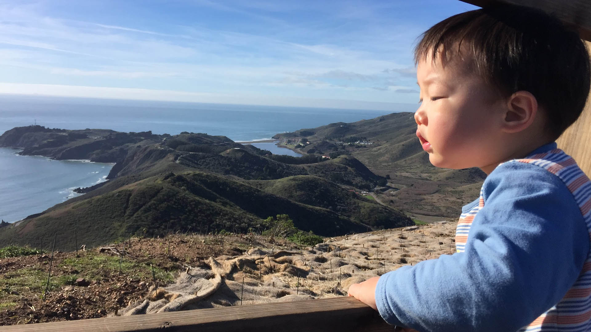
How can large trees or structures enveloping a path or alcove enhance the experience of the space as a “small” or private one?
Context and surroundings are essential for small spaces within a landscape. It’s not just the contrast of scale – contrasting qualities essentially contribute to carving out small and special moments! We experience space sequentially; darkness makes light precious; softness becomes special within roughness; and compression lends drama to openness. Sometimes special moments can be achieved by revealing the eccentric qualities of the surroundings.
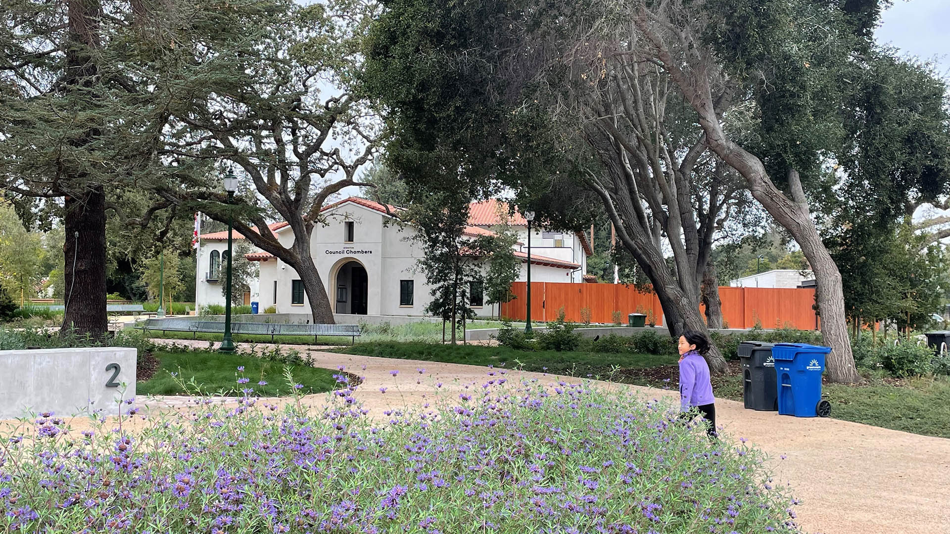
To encourage a rich experience and appreciation of an environment, we often find our “jewels” for a given project in response to their context. Many times, the response starts from personal feelings… but we recognize that people will carve out their own moments of wonder and contemplation within whatever we create.
Any given person’s experience of a space is unique. But by juxtaposing the grand scale of a river, old-growth trees, a towering building with a sunken courtyard, a private balcony, or a seldom-used place on a trail, we invite all users to embark on their own journeys. Even within the most iconic landscapes, you will find people pulling away to find their own views, process their own experiences, and speak privately. Even when designers don’t specifically allow for these spaces, they happen as a natural outcome of human activity – and we should take note.
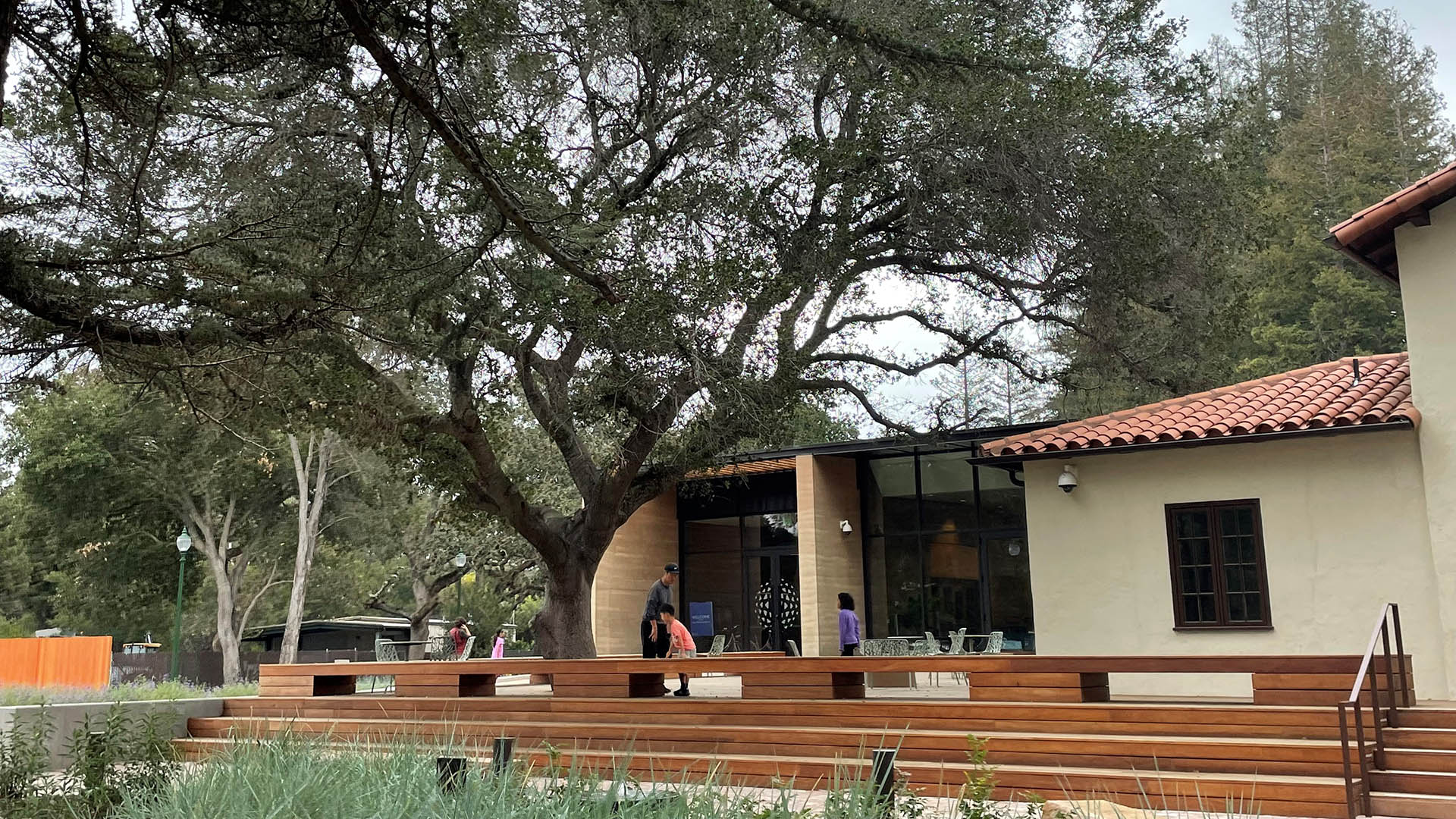
You mentioned the window where your children gather to see you departing for and returning from work. Do you have a favorite “small space” of your own?
Indoors, I love the health room in our office! It gets the afternoon sun, and from the window I can see kids playing in a schoolyard. In some ways, it is like a church, where I can become immersed in my inner world. I also love TransAmerica’s Redwood Park in San Francisco – it’s a kind of private refuge within the city. 560 Mission’s bamboo courtyard (an SWA/Balsley project) is another favorite. Nice sunny terrace with food service, lots of people watching opportunity with cool bamboo planting
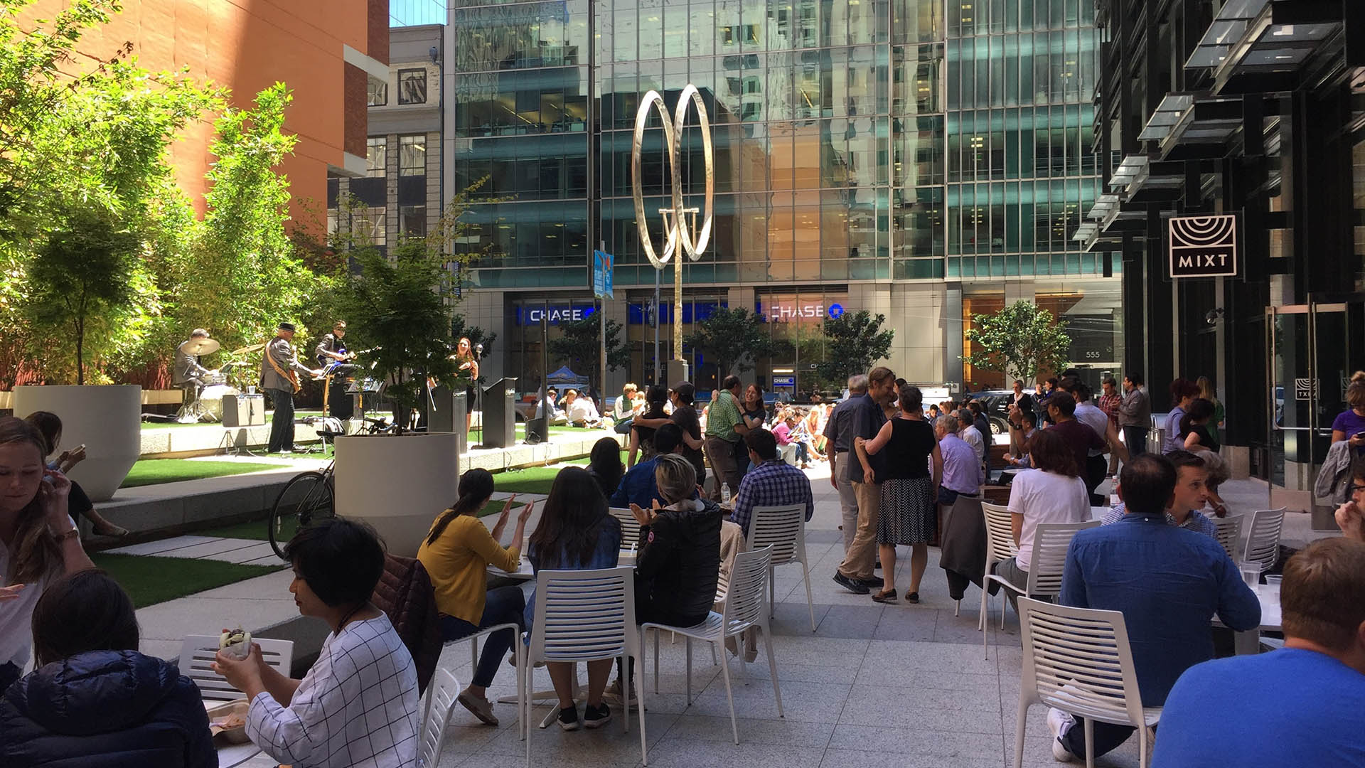
There are so many others I could list, in San Francisco and in the world at large! All of them inspire me in my work and in my daily practice. I think that as designers, we should recognize the specialness of small spaces within the physical environment, and honor the emotions that are associated with them.


