Reimagining Retail
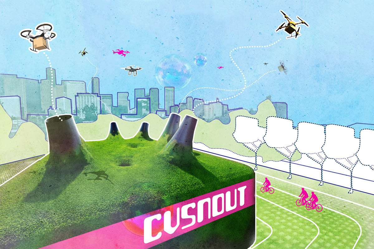
With an eye toward the future, Landscape Architecture Magazine asked a handful of professionals – including SWA Houston Principals Kinder Baumgardner and Natalia Beard – to reimagine urban retail through the lens of the past year. SWA’s contributions, including some striking graphics, made the cover.

We asked SWA Principal
Natalia Beard
for the back-story:
How did you all approach the question?
When we were asked to participate in this effort, we looked at it as an opportunity to explore why we loved shopping. (I love to shop and if I’m stopping, everyone else is too.)
COVID hastened what seems like an inevitable decline of retail and, with people sheltering in place, restaurants and street life in Houston collapsed. It was so disappointing because we’ve made such an investment in downtown—we moved our office in to the urban core and have been working on helping the Downtown Management District enliven Avenida Houston, Main, and other streets.
We’re strong advocates for street activity and we wondered how could the city maintain some sort of physical presence for sellers, without the insurmountable rents, and an opportunity for street life for shoppers?
When we thought about it, we saw shopping less as a transactional activity of “buying” and more as a reflection of people’s fundamental need to be together, to be connected—to each other as well as to culture and fashion. It’s why kids go to a mall—they aren’t buying anything of substance; they want to be with their friends.
We didn’t take ourselves too seriously. We had fun with the question: When you go to a city, what do you love? What would younger audiences love? We imagined different groups of shoppers and what might appeal to them. How could we include an idea of participatory street performance? How can you maintain urbanity?
We came up with some ideas, kind of goofy, but they address those fundamental needs for human expression, connection, performance and exchange.
What surprised you?
What surprised me most about the exercise was how quickly and easily we were able to deploy non-standard graphic language. We could let go of the earnestness of traditional representation and embrace a kind of 1960s grooviness– happy colors, fun forms. We were completely liberated from client- or budget-driven design decisions and could just be experimental and whimsical.
What do you think will stick?
We were strategic in choosing Houston’s Dallas Street because we think that street can lift downtown to the next stage of livability. We liked that our thinking was a way of conveying to our friends on the street—in retail, restaurants—that we support them. The ideas we came up with had some humor, but the main thing is we are advocates for urbanity. We’re sticking with it.


